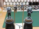
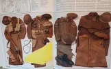
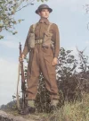
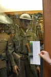
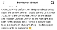
Ben beetje op het web aan het rondsnuffelen mbt de kleuren om te gebruiken (ook hier weer helemaal inkomen 🤣 ).
En dacht, zal de zee ff wat verder opwarmen an AI proberen. Nu kwam gemini met dit verhaal, klopt daat een beetje en kan ik dat aanhouden?
De informatie in dit kader is door AI gegenereerd.
WWII Canadian Battledress (Serge) has a distinct greener tone than standard British uniforms, which lean brownish-mustard. For 1/35 scale, Vallejo Model Color gives you accurate scale effect shades for the uniform, P37 webbing, and the PIAT weapon system itself.
Canadian Battledress Uniform
- Base: English Uniform (70.921) mixed with Russian Uniform WWII (70.924) in a 2:1 ratio (captures the iconic greenish Canadian wool shade)
- Shadow: Add German Camo Black Brown (70.822) to the base mix
- Highlight: Add Buff (70.976) or Khaki (70.988) to the base mix
P37 Webbing & Equipment (Pouches, Straps, PIAT Ammo Case)
- Base (Blanched Khaki): Khaki (70.988) or Green Grey (70.886)
- Shadow: English Uniform (70.921)
- Highlight: Iraq Sand (70.819)
Helmets & Hardware
- Mk II Helmet: Olive Grey (70.888) or Bronze Green (70.897) textured with fine sand
- Boots & Ammo Pouch Trim: Black (70.950) highlighted with German Grey (70.995)
- Gaiters/Leggings: Khaki (70.988) with Dark Grey straps
PIAT Launcher & Ammunition
- PIAT Body Base: Bronze Green (70.897) or Dark Green (70.979)
- PIAT Body Highlight: Mix base with Buff (70.976) to show metal wear
- PIAT Bomb (Projectile): Olive Drab (70.887) body with Black (70.950) fuse tip and Yellow (70.953) band
De informatie in dit kader is door AI gegenereerd.
Painting heavy wool fabrics like WWII Canadian Battledress at 1/35 scale requires smooth transitions between deep shadow creases and raised highlights to create realistic volume.
Thin your acrylic paints with water or acrylic thinner to a milk-like consistency (roughly 1:2 paint to thinner). Thin layers prevent paint build-up and preserve the fine detail of the figure.
1.Apply the Basecoat:2-3 thin layers.
Apply your base mix (2:1 English Uniform to Russian Uniform WWII) evenly across the entire uniform. Work in 2 to 3 thin coats rather than one heavy layer to ensure smooth coverage without filling in fine details or deep creases. Allow it to dry completely.
2.Deepen the Shadows:Focus on creases and undercuts.
Mix a tiny amount of German Camo Black Brown into your base mix. Apply this darkened shade into the deepest recesses: behind knees, under armpits, along seam lines, and inside fold valleys. Keep your brush strokes moving
into the shadow zone so the highest concentration of pigment lands in the deepest recess.
3.Layer the Intermediate Highlights:Build volume on raised areas.
Add a small drop of Buff or Khaki to your original base mix. Paint the broad, raised areas of the fabric—such as the fronts of thighs, shoulders, elbows, and top crests of fabric folds. Leave the basecoat showing in the transition zones between shadows and highlights.
4.Apply Edge Highlights:Sharp detail on high points.
Mix additional Buff into your highlight shade. Using the side of your brush (edge brushing), feather this light shade onto the sharpest high points, such as pocket edges, lapels, collar ridges, and the prominent crests of major folds.
5.Tie the Layers Together with a Filter:Optional blending step.
If the transitions look too harsh, apply a very thin, translucent glaze/wash of your base color over the entire uniform. This unifies the highlights and shadows, softening harsh transitions and mimicking the textured look of heavy wool fabric.